
Estrela – Lucky Star
An apartment in Lisbon
Chord and Tangent: or how we found the importance of the curve
As great stories go, this is one to keep for the records.
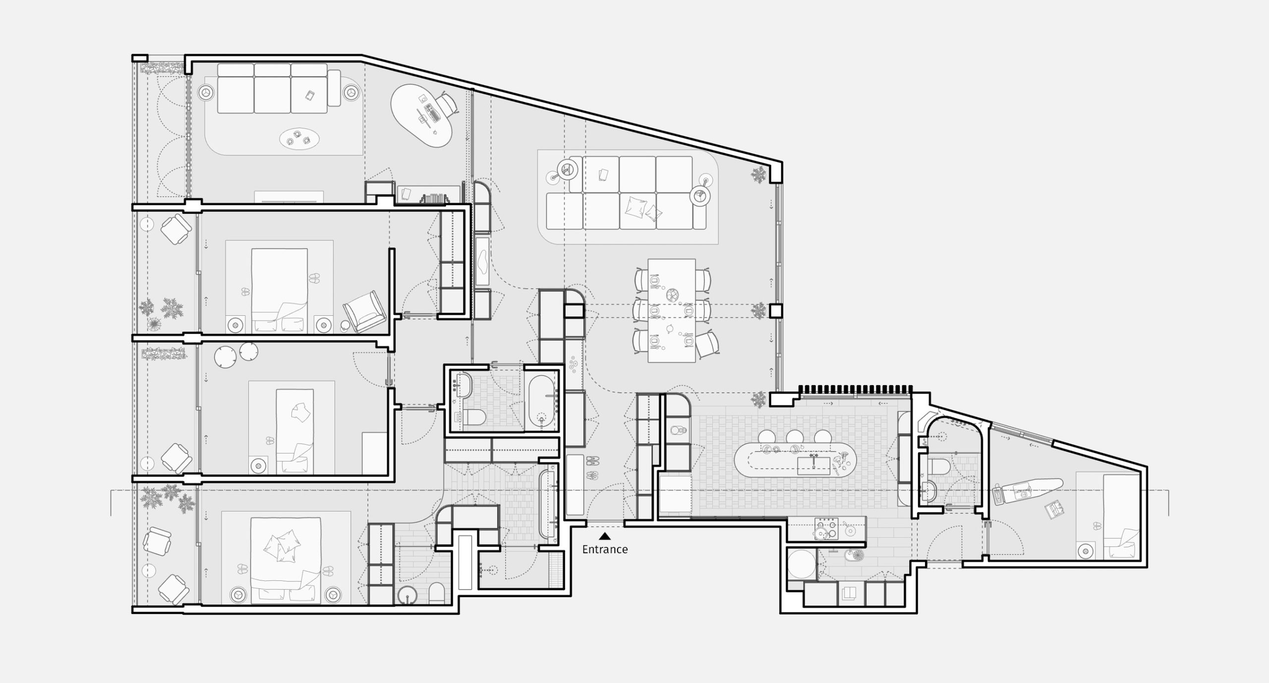
As a young couple, moving between countries and business clients as one moves between hot chocolate choices, was looking for a place to live in Lisbon, there were several priorities which they felt should be met: spatious, light-filled, not too complex or technically challenging to change/renovate, and something which felt just right for both of them and their child.Now, something which feels right is a common principle when house-hunting: you may see 20 prospective houses in one day that seem to fit the briefing, but there’s always something missing you cannot truly pinpoint.What no one was waiting, or hoping for, was that you could find something truly special on a street in Lisbon which most Portuguese children grew up seeing on TV (the official Prime Minister Office “sits” proudly and grandly just opposite the building).
So, street-wise it was a win-win situation in terms of a prime location, but there was a setback.
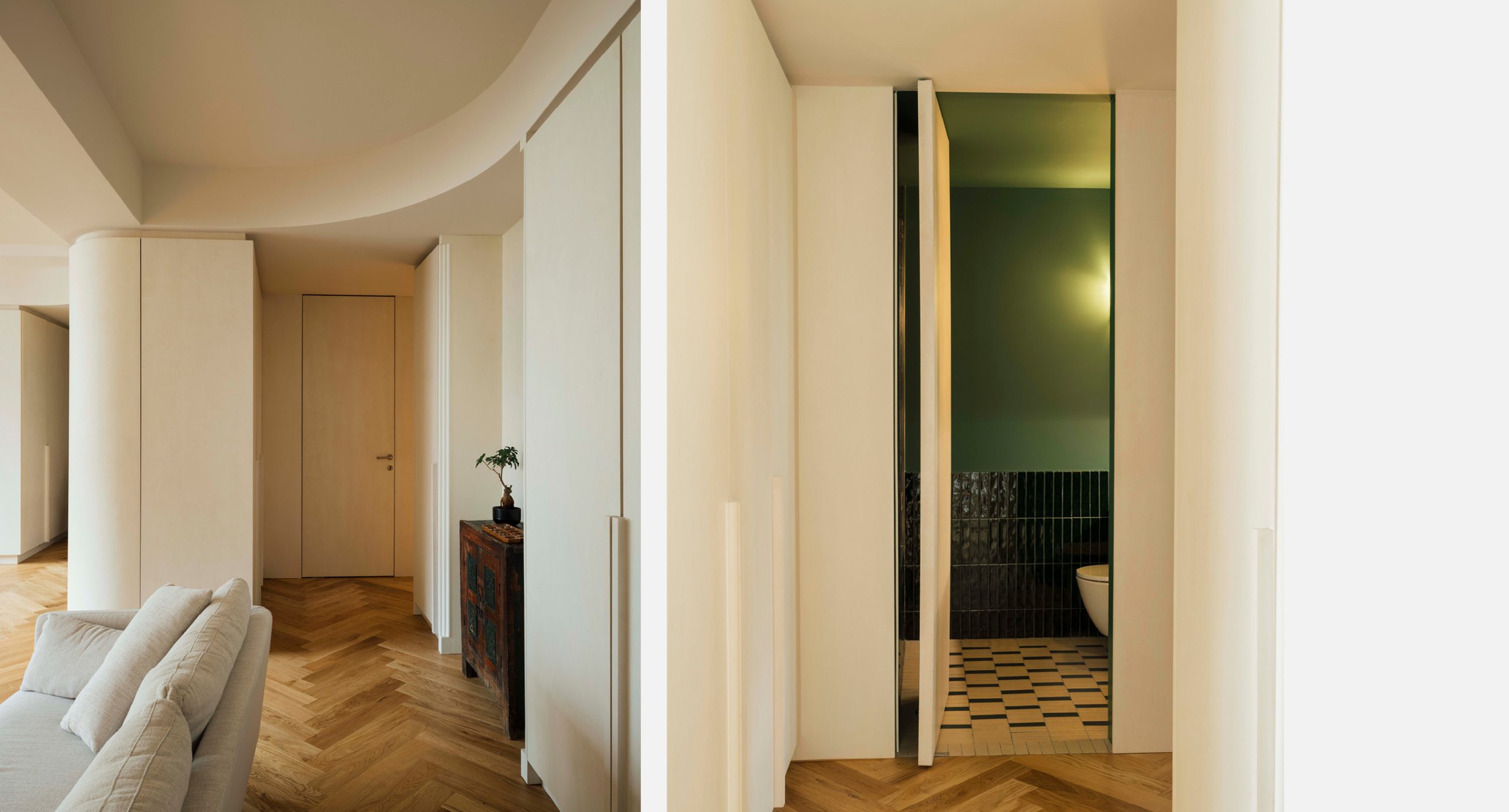
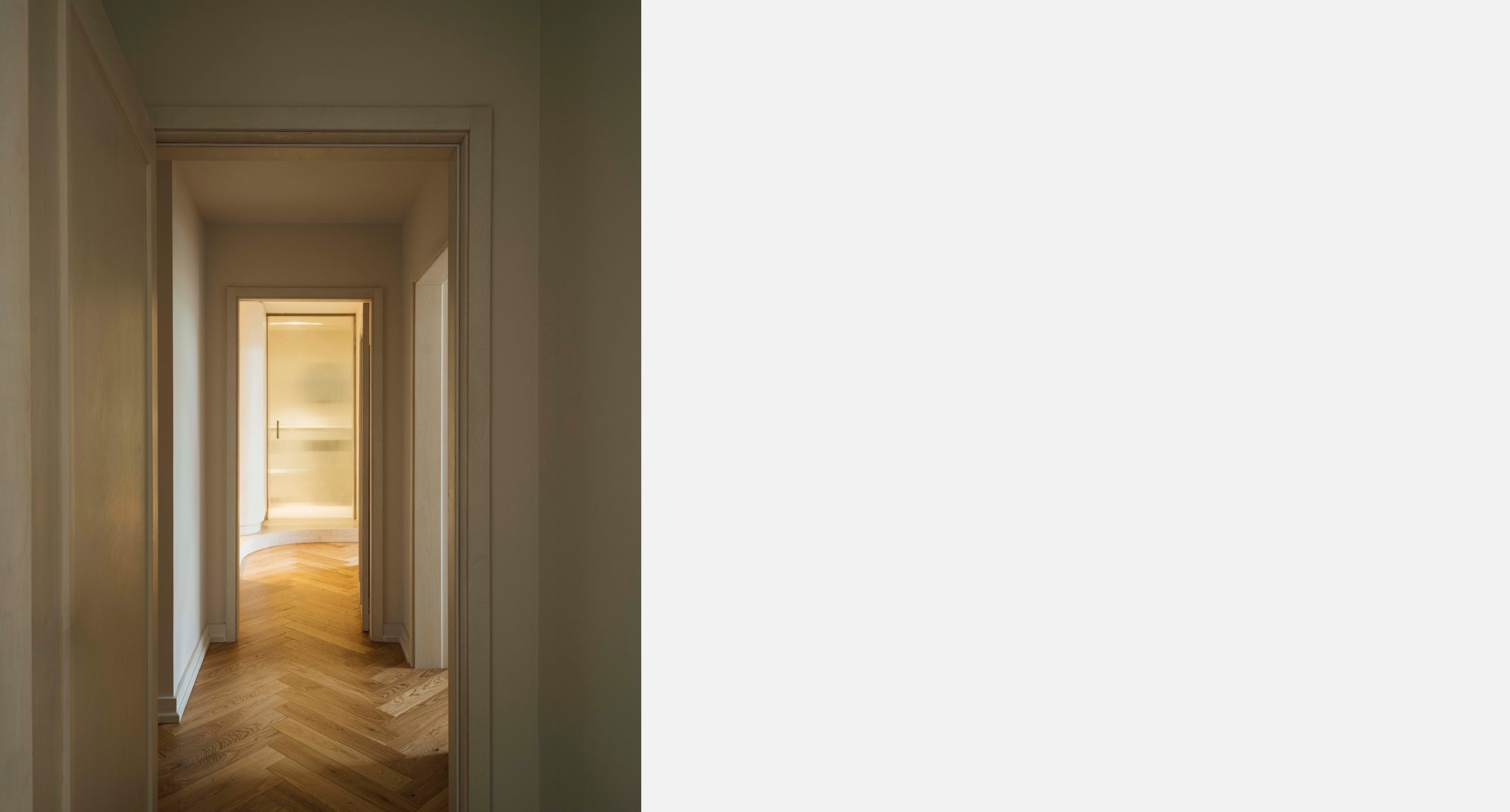
As we got the go-ahead, a transformative idea came as a perfect silver lining: to re-configure everything which was strict and straight, and boring, into something smooth and sensual. Form, which is so important for us as a Studio, took the shape of extraordinary curves and angles throughout the spaces, opening up and tearing up closed compact cubicles into light, airy and see-through areas.
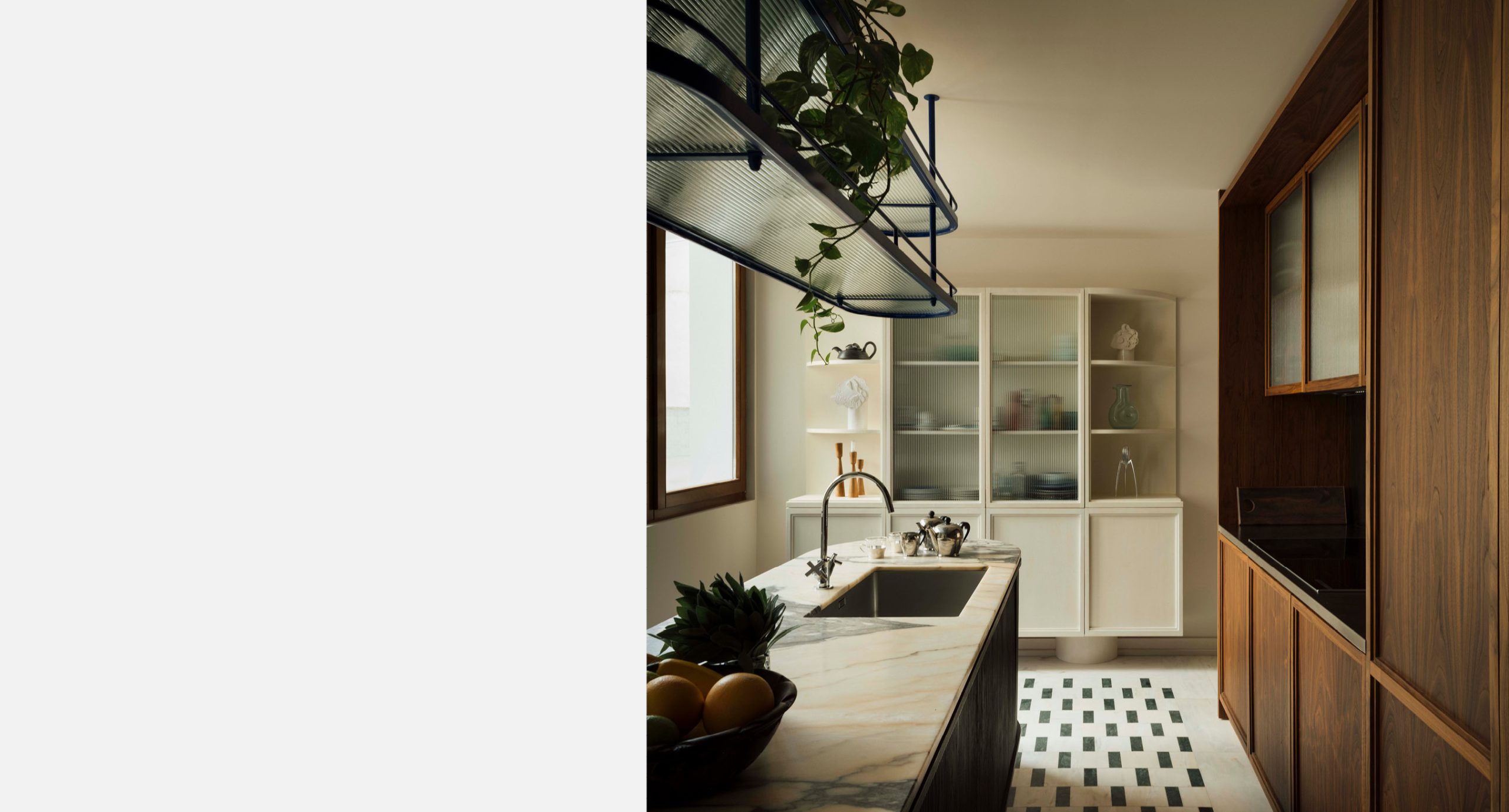
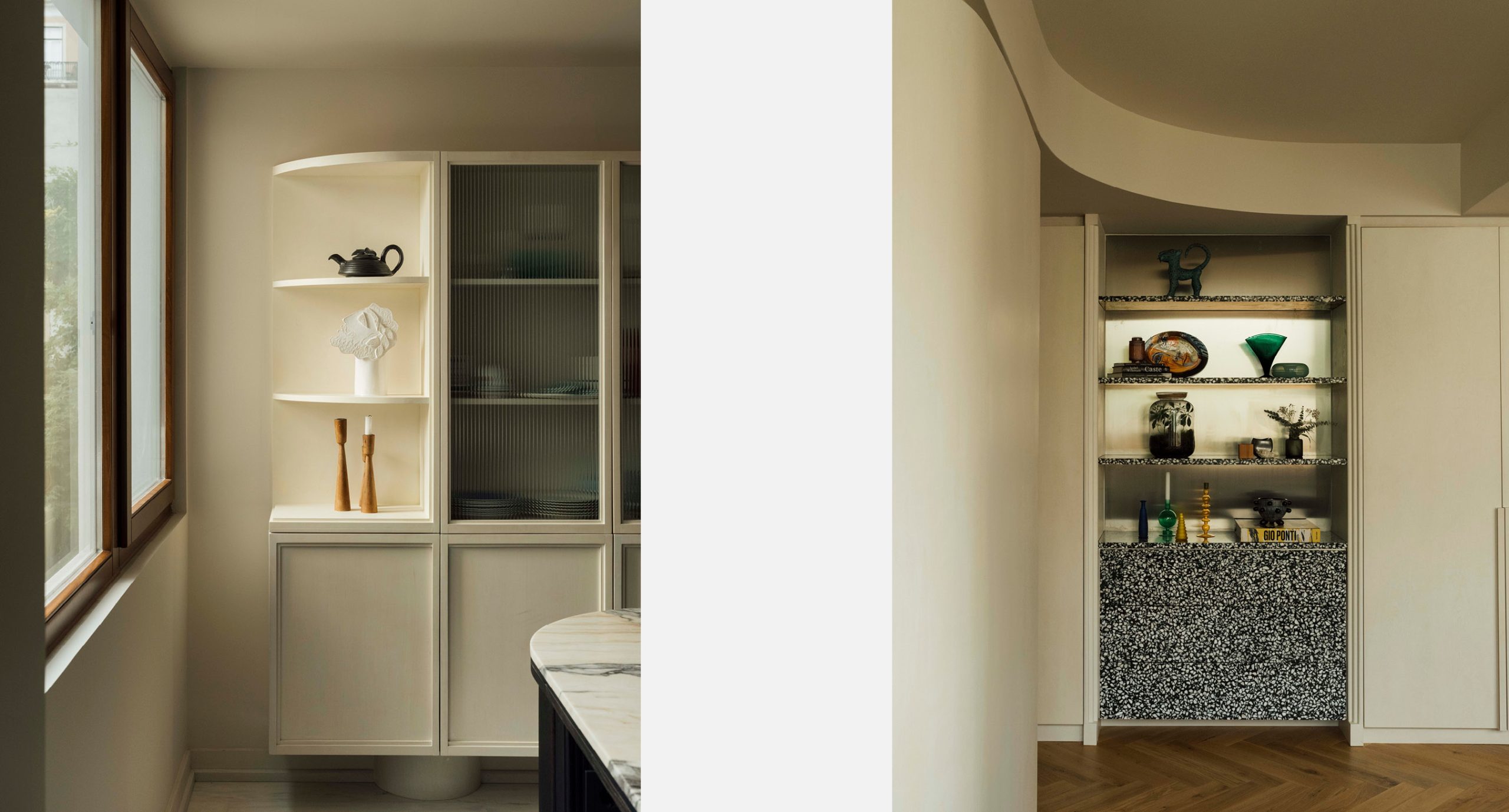
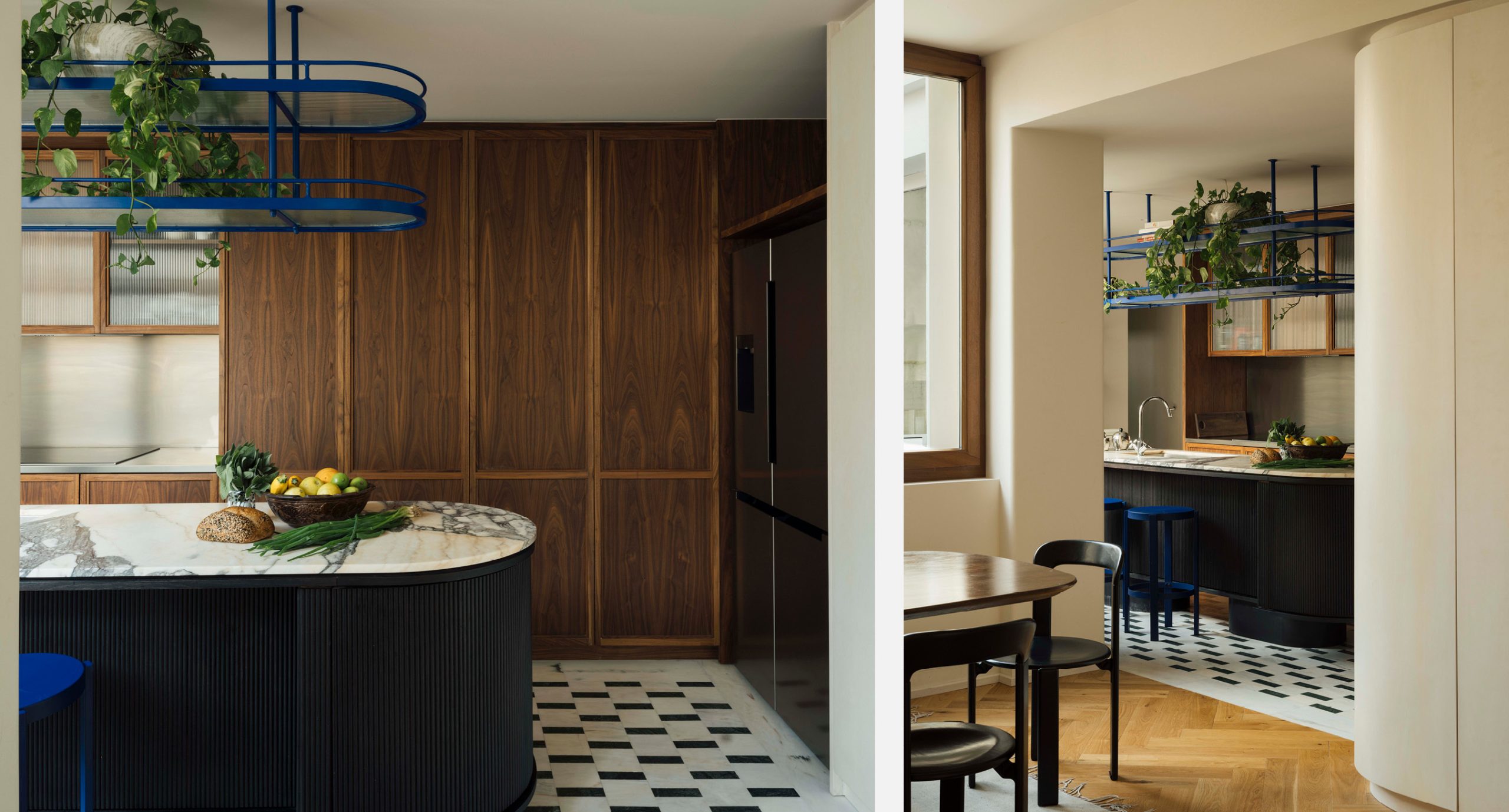
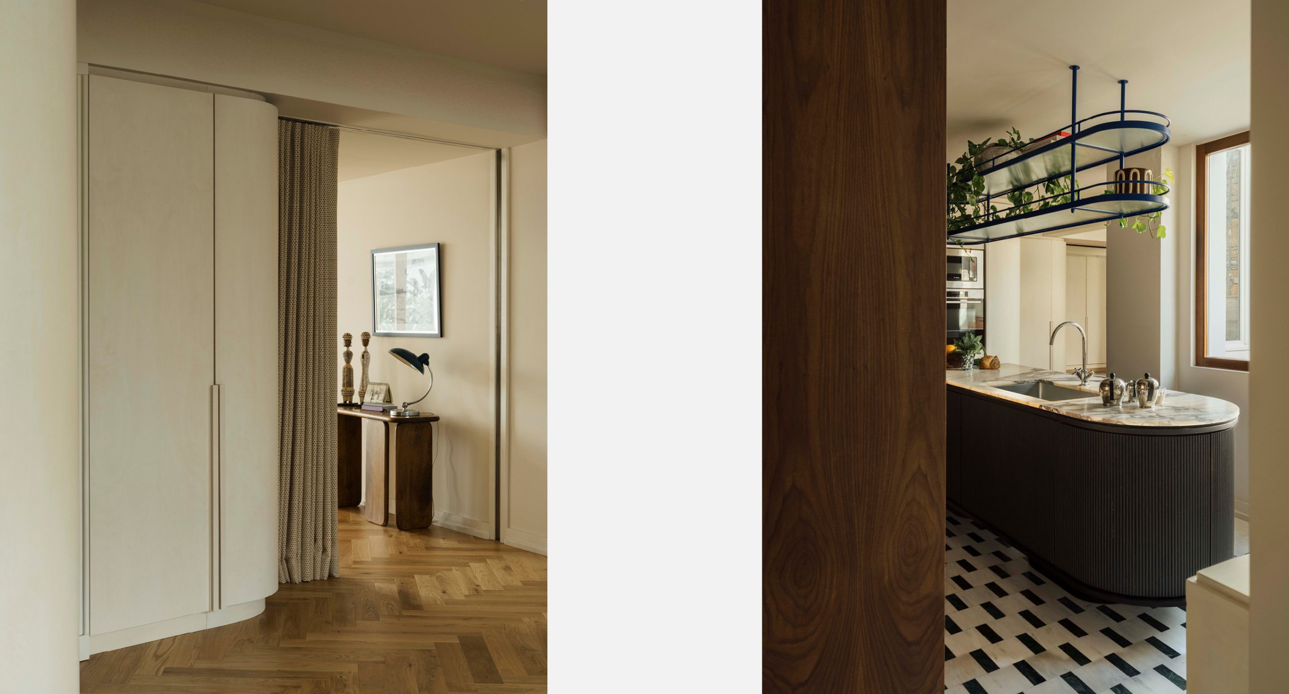
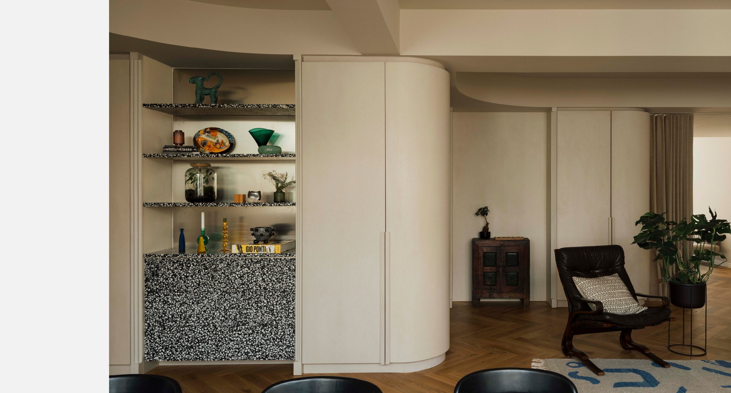
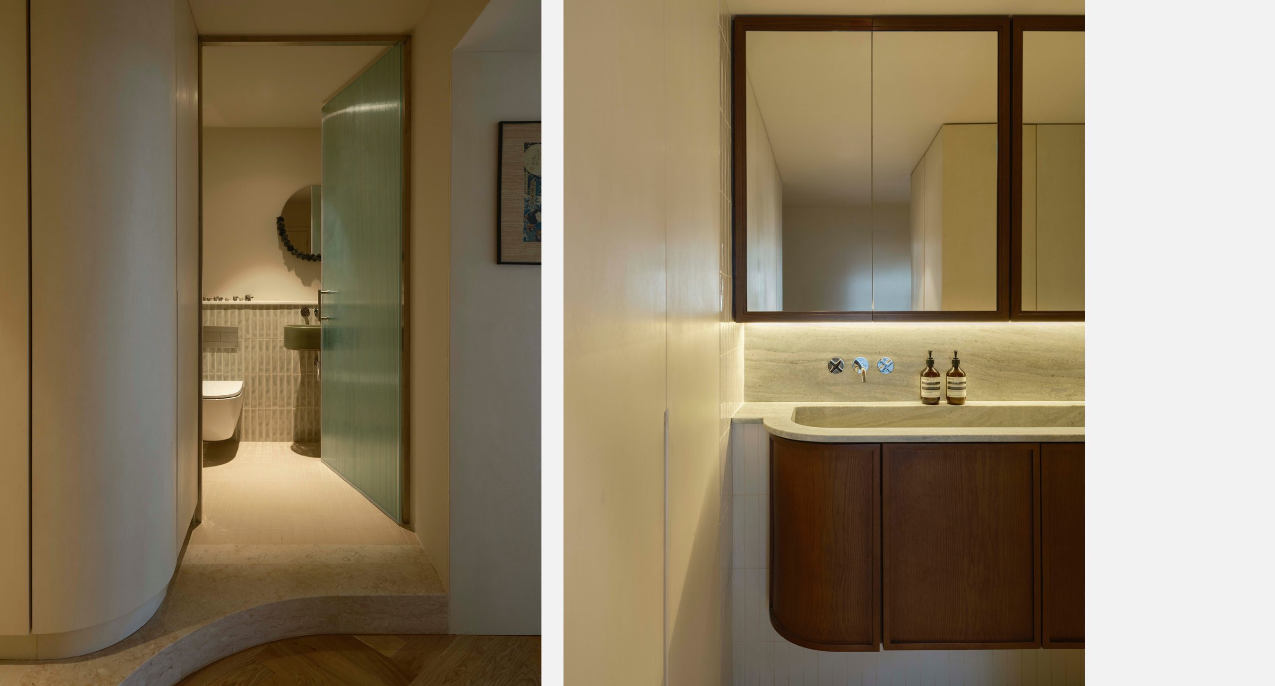
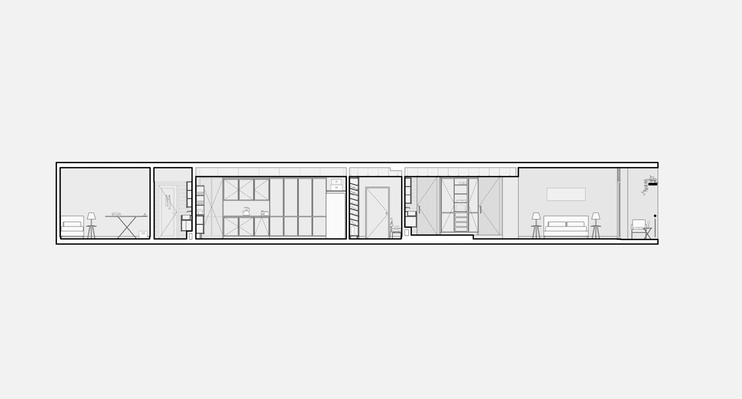
As the light enters from both fronts, and as it encounters an open living room, we had to understand something truly important for this family: the need for working spaces which could be easily and efficiently turned back into communal areas, but which gave the feeling of privacy when needed. The main visual codes of this project are therefore the smooth now-you-see-it-now-you-don’t storage units and cupboards which are everywhere, but totally integrated in the structural elements.
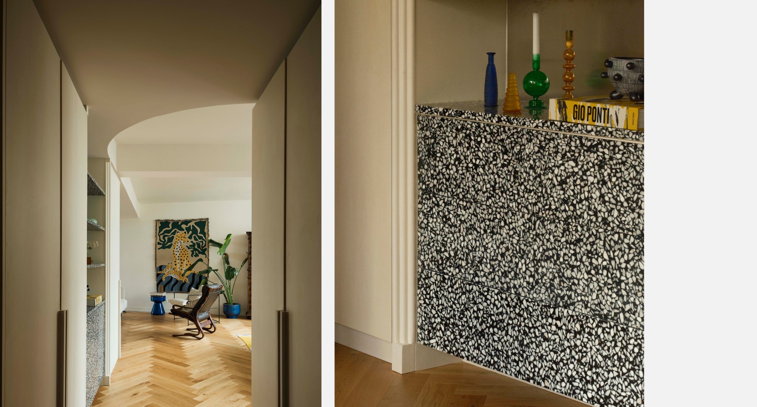
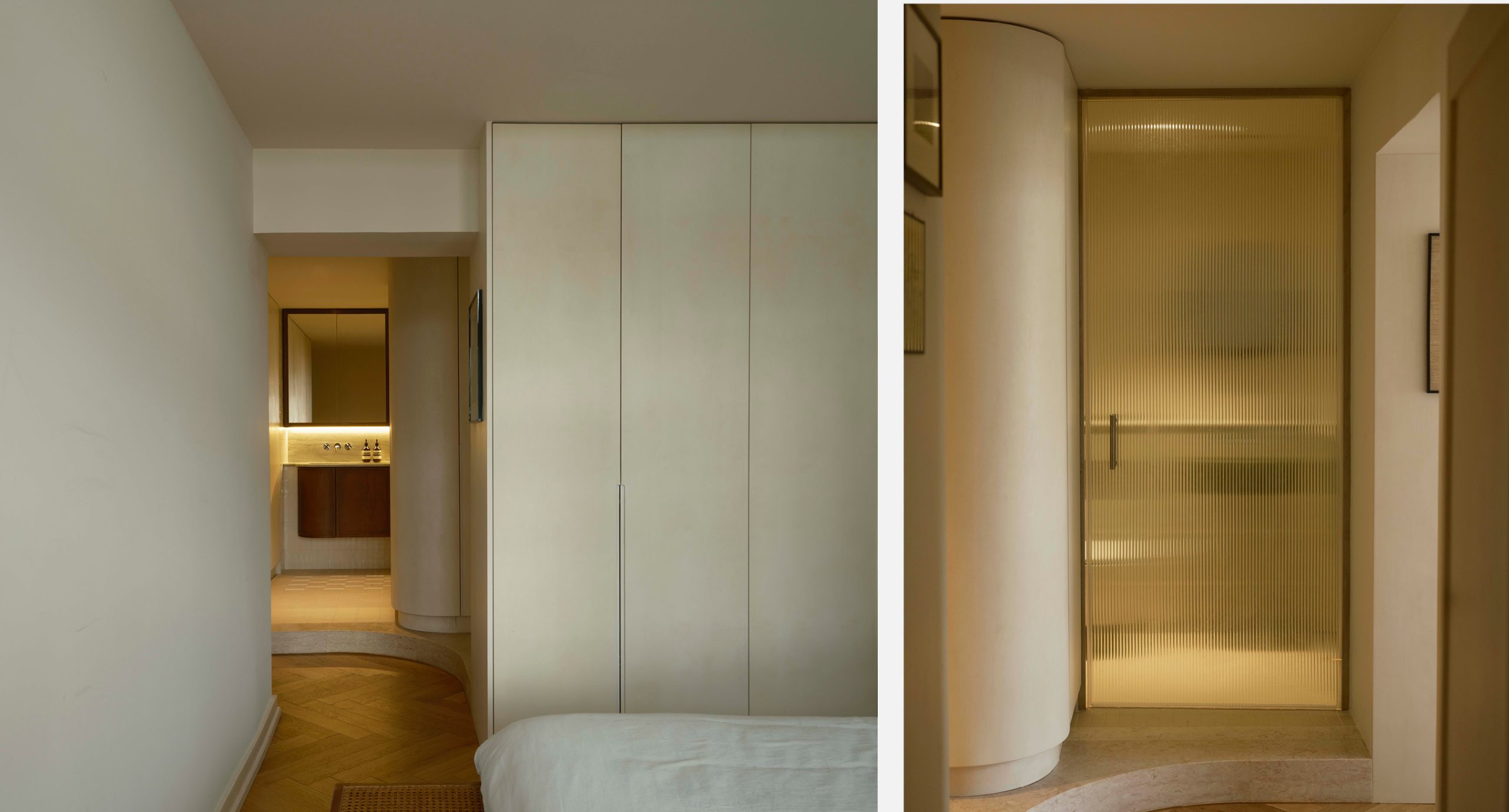
In fact, the walls seem “curved” and angular because most of them hide clever storage inside. You can say it’s a bit of a Toblerone strategy, as the tip hides something moist. Those curved elements, which bring forward a sense of movement and lightness, became one of the project’s highlights, and its signature. Architecture and Design have always been very vocal (and not always positive) about the curve. Even before Niemeyer made it ubiquitous, although he had zero originality in his claim as Antonio Sant’Elia and then Piero Portaluppi were first), the curve always poses complex challenges.
Something which is not straight or right, literally, is more difficult to control.
Well, control is utterly overrated.
Maybe something which flows freely brings something which we call shape.
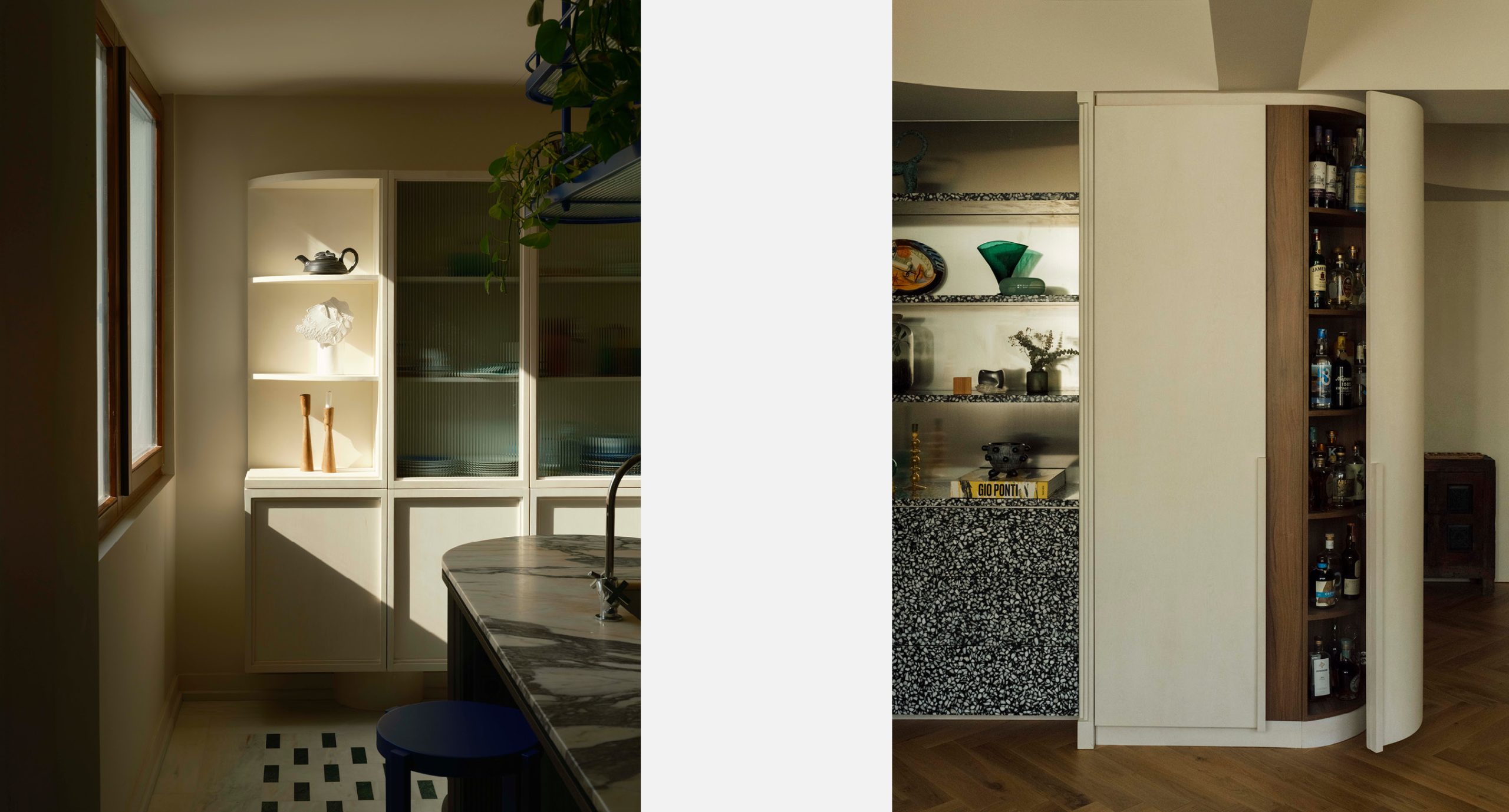
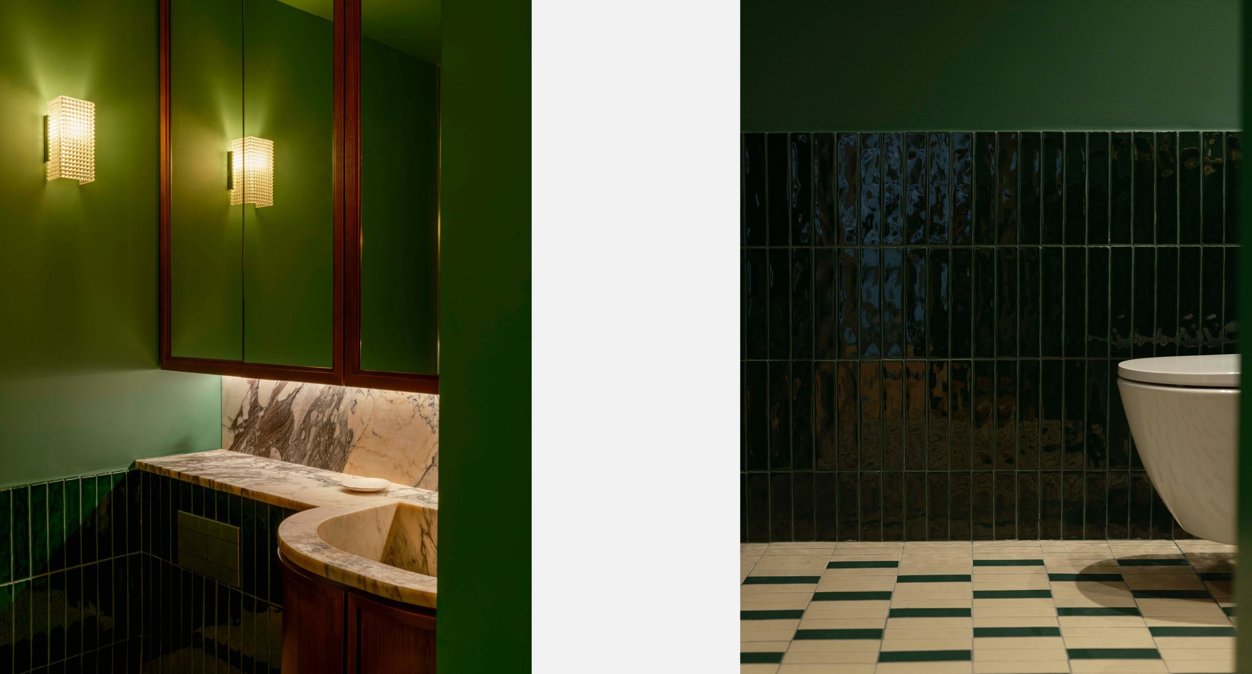
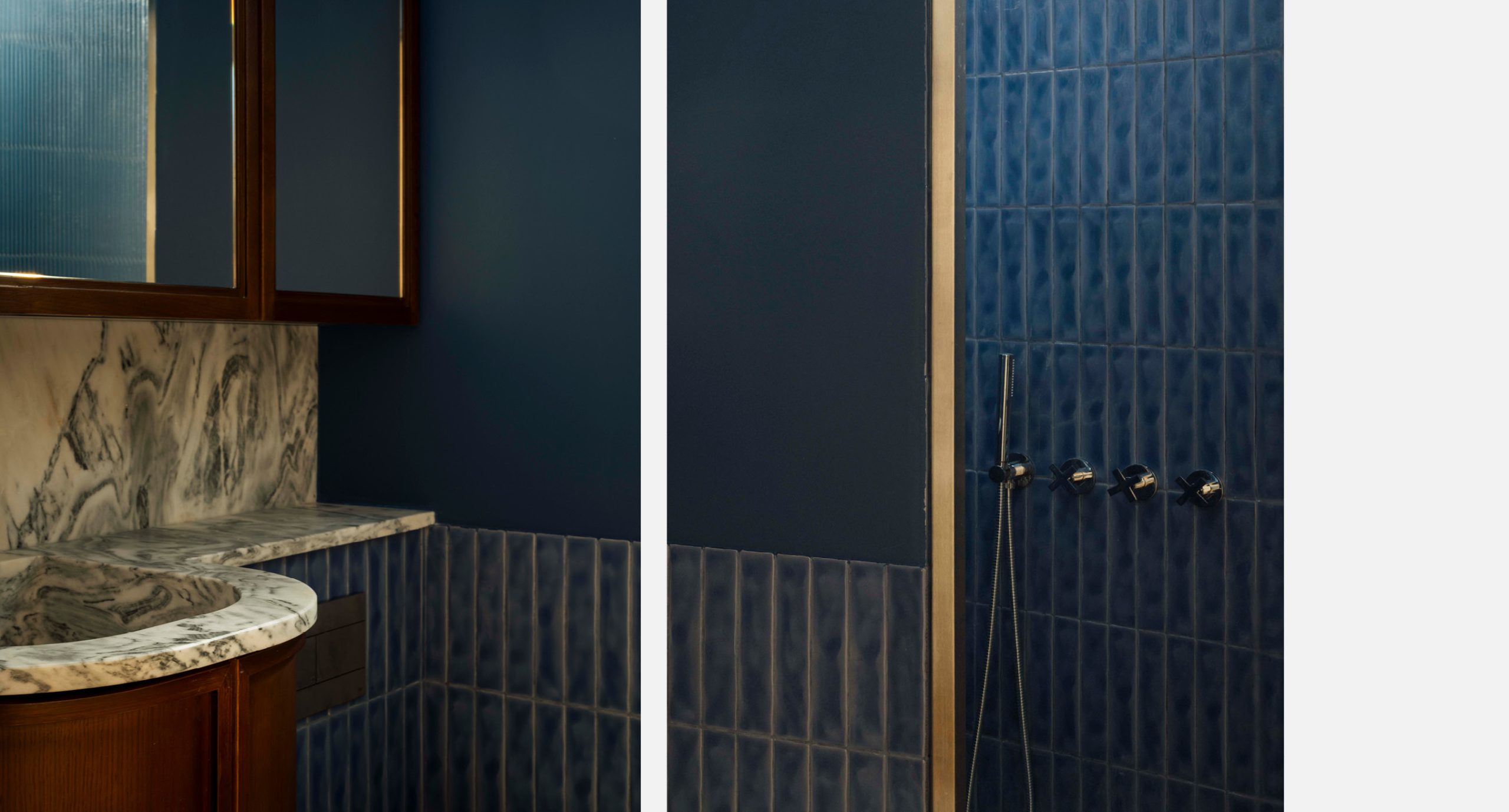
Light is treated as a primary material in the project, shaping how surfaces breathe and how each area reveals itself throughout the day. Rather than simply illuminating the space, light softens transitions, highlights depth and sets the mood from morning brightness to evening warmth. The raw-sanded birch veneer carpentries with a warm white wash respond delicately to this approach, catching and diffusing light in soft gradients. Inside these volumes, a warm walnut veneer adds richness and intimacy, introducing layers of contrast that elevate even the most functional elements, creating a balance that feels at once modern and classic.
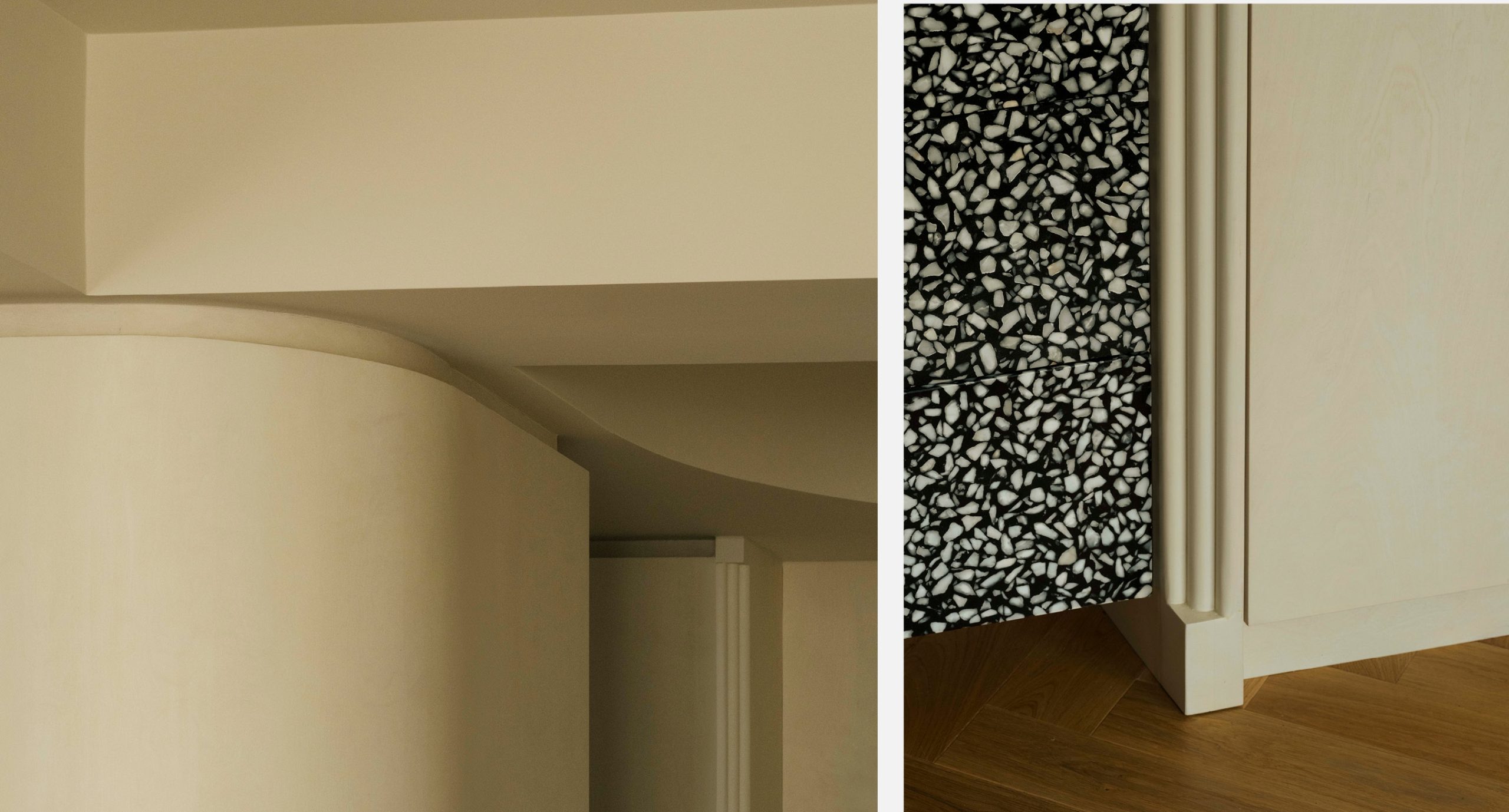
A defining gesture of the project is the stair-like layout. This stepped geometry allows different areas to serve different uses while remaining visually connected, ensuring that every zone feels intimate without losing openness. The same stair imagery is echoed in the vertical wall mountings, reinforcing a subtle rhythm throughout the space. The gentle curve carved into each “step” was essential. It softens the geometry, guides movement and brings a sense of fluidity to the architecture — a recurring Spacegram gesture where form and feeling meet.
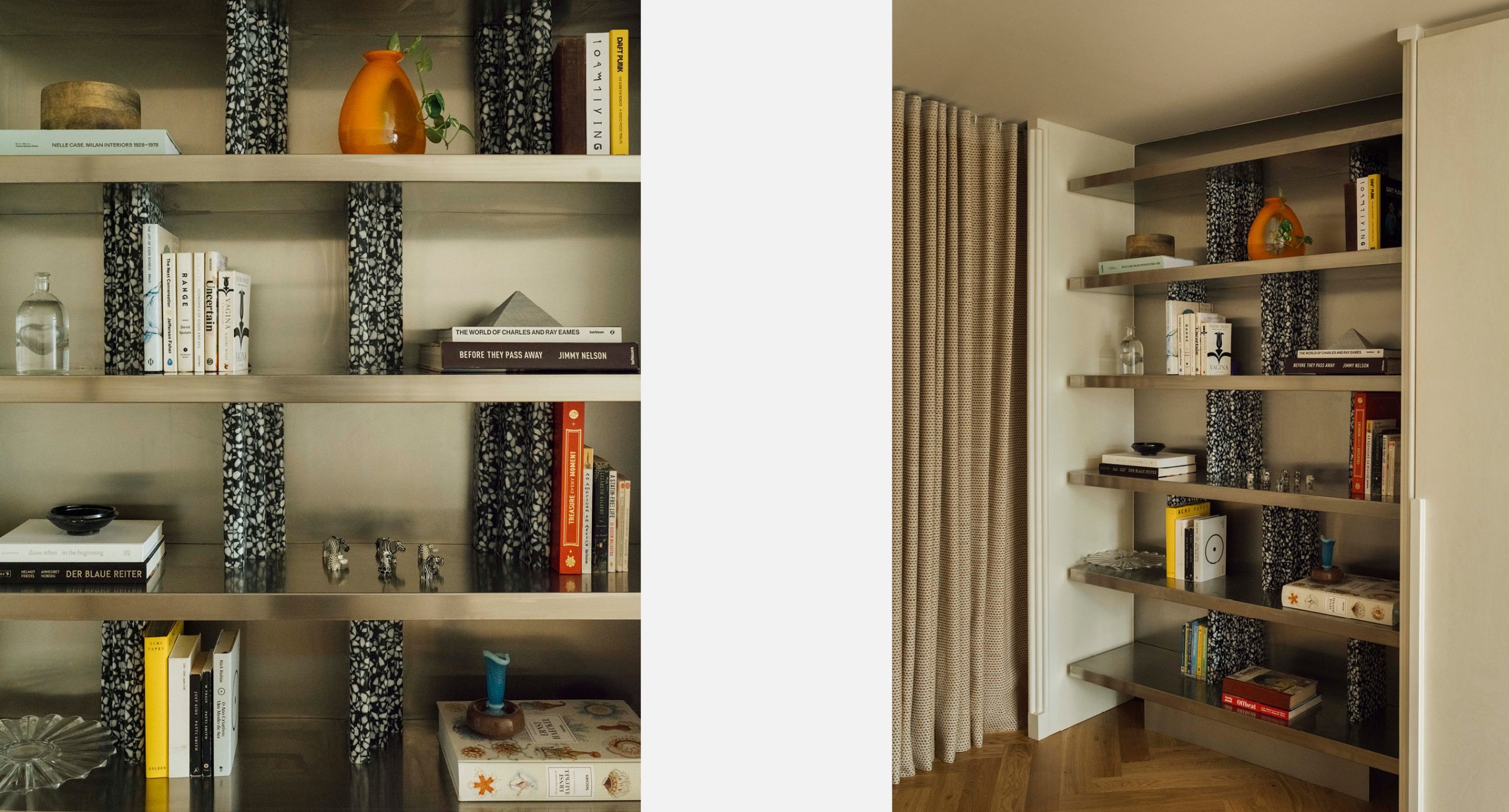
The bar and shelving explore a deliberate dialogue between classic references from the existing building and a more contemporary approach. Geometric cues nod subtly to Art Deco influences, grounding the intervention in the site’s architectural memory and giving continuity to what was already there. To balance this heritage, modern materials are introduced with precision: raw aluminium for a sharper, cooler presence and dark terrazzo for depth, grain and permanence. Together, these elements form a harmony of contrasts — warm textures beside crisp metallics, soft carpentries beside bold stone — giving the space a distinct identity and a clear visual structure.
This interplay between past and present becomes one of the project’s key signatures, anchoring it in time without limiting it. The result is a controlled tension — a space that remembers and reinvents at once, allowing each material to speak its own language while contributing to a cohesive whole.
Location:
Rua da Imprensa á Estrela
Date:
2025
Typology:
Apartment
Status:
Built
Team:
Ana Ferrão, Bruno Pereira, Gilberto Pedrosa, Micael Pepe, Ricardo Nogueira
Photography:
Matilde Travassos